Monday, March 21, 2011

My Portfolio Facelift

Here's a little of my work in progress.... I refer to it as a portfolio facelift, partly because portfolio tummy tuck doesn't sound as good. These were created with the goal of not only being new portfolio pieces but also mailers with an impact. I focused on dynamic points of view and expressions. Read on and enjoy.

Jack and the Beanstalk


The Princess and the Pea


Rainy Day


The Tea Party


site: www.maryuhles.com
blog: www.fabulousillustrator.com

Sunday, March 6, 2011

'Walking Through Walls' is a work in progress.

   Being a new contributor, as of today, I wanted to share my current WIP, Walking Through Walls, by Karen Cioffi (releasing May 2011 from 4RV Publishing). Most of the same post will be available on my own blog, directing them to here too, so that I can introduce my current readers to this blog, as well.

Walking Through Walls is an MG (middle grade), novel re-imagining an old Chinese folk tale. There are ten chapters, and I have finished  seven, so far (one illo for each chapter). Here, I share two completed illos (chapter one and chapter five), and the last illo, a rough from chapter nine. As a matter of fact, I had hoped on finishing these up prior to the release of the ARCs, but I just couldn't work that fast (only had a month to do the design layout, the research on Chinese period clothing and harvesting tools, the sketches, and completed illustrations). So the reviewers will see seven completed illos, and three roughs. Oh well. It's an ARC, so it's acceptable.

I do tend to gravitate toward high contrast looks, but in this instance, I am paying homage to the ancient oriental paintings. The one done in black ink with nothing more than a stiff brush. The style is mine, and more modern, but I wanted the feel of black on black, like those.

Cover blurb:
Wang longs to be rich…and powerful. At twelve-years-old, he already knows more about the Eternals and their way of life than many of the adults in his village. Learning about these mystics takes his thoughts away from the possibility of working in the wheat fields all his life, like his father.

Wang has far grander goals.

MG/Tween/YA
ISBN: 978-0-9826594-7-2
Available June of 2011 (ARCs available now, for book reviewers - contact author or publisher for more info)

Now, let's look at the illos...
In chapter 1, we see Wang working hard in the wheat fields, in the hot sun, with his father, loading bundles in a wagon.
In chapter 5, Wang comes face to face with the Master Eternal and two student mystics, after a long, arduous journey.

Now for the rough...

In chapter 9, Wang is scheming how to use the magic the Master taught him, to steal from a rich merchants house.
As you can tell, compared to the finished pieces above, I have a bit of refining to do. Plus, there are two more 'roughs' on my drawing table that need finished, as well. This one will be time consuming because of all the detailing that needs added in the wall and doors, and the tree leaves. But that's okay, I have a perverse attraction to intricate patterns ... lol.

Thanks for letting me share my current WIP. I welcome any and all constructive comments.

Tuesday, February 22, 2011

How To Illustrate A Puppet


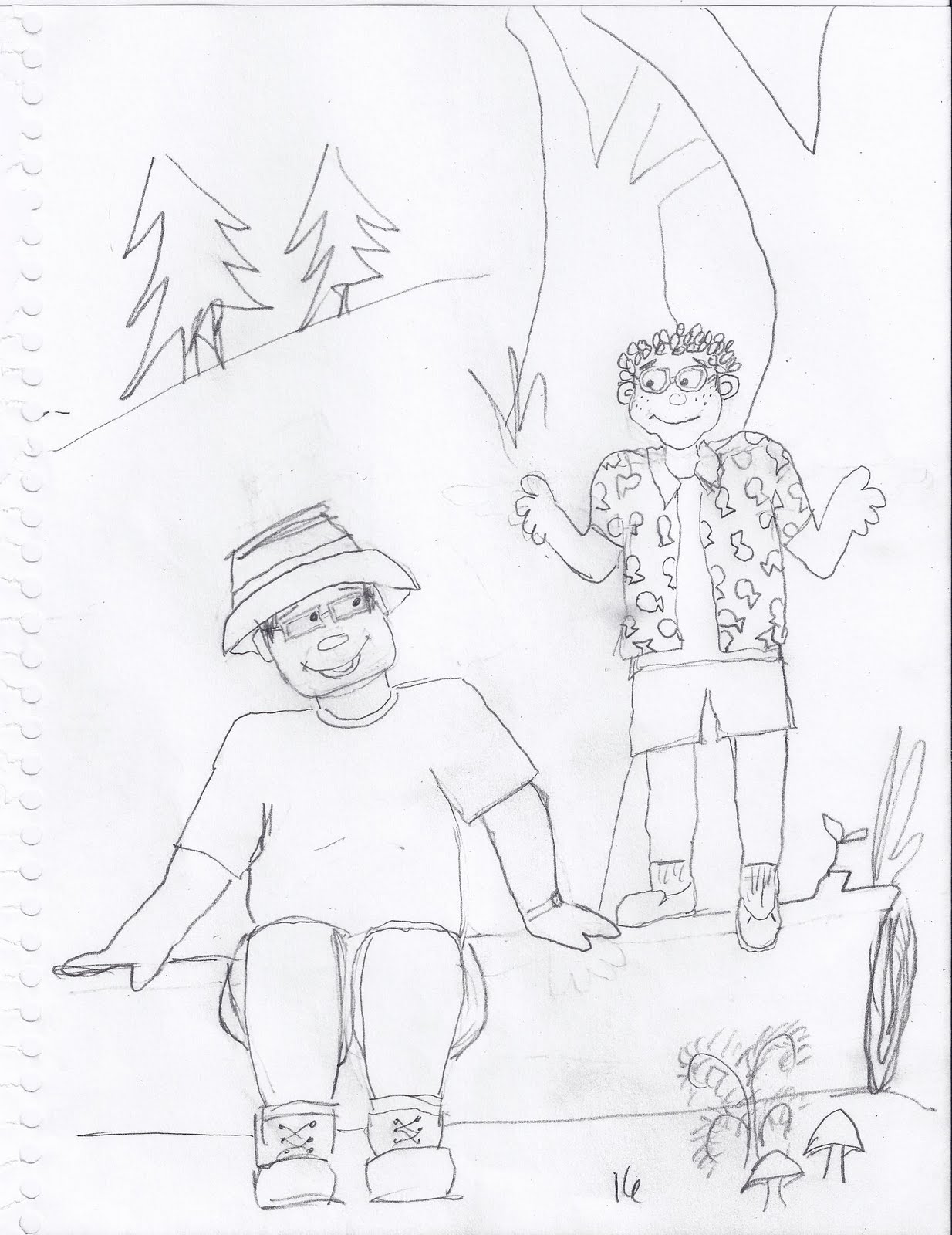
Being asked by Robb Killen of Killen Creations to illustrate four children's books was not only flattering, but challenging as well. You see, Robb's main character Webster is a puppet in which he uses in the Nashville Public school system third and fourth grade classrooms to teach lessons on dignity. He also has a club titled the P.O.D. Squad (People Of Dignity). Webster also has a DVD series in which all of his co-stars are humans! Therefore, when sitting down with paper and pencil in hand, my little friend was easy enough to draw, but what about his human family and friends who were written into his books? After drawing them "human-like", Robb and I decided to "puppetize" them (if there is such a word)! Here are the sketches I came up with for the first book about "Feelings" where Webster goes on a camping trip with his Uncle Charley and his cousin Roy.


Monday, February 7, 2011

2011 SCBWI NY Conference

The 2011 NY conference was such an inspiration! Here are a few photos & ramblings from the POV of a Midsouth Illustrator in the big city! 
Nashville was NOT snowy but NY was, so I got off to a late start...

I stayed with my daughter and saved the big bucks for the NY hotel room. I missed late night chattering with my friends... but oh well!
 
Wow! That Leonard Marcus Tour of famous sites in Children's Books was just amazing. Here are a few pictures so you can see what it was really like.
Grand Central Station- inspiration for many
The Children's Entrance to the NY Public Library

The most famous stuffed animals I know of.
Wall murals in the children's room
Original Charles Scribner & sons Building where Children's Publishing in America, began.
This fountain sculpture in Rockefeller Center was sculpted by Rene Paul Chambellan. He also sculpted the reliefs for the Newbery & Caldecott Medals!
Original home of Simon & Schuster & later, Golden Books
Plaza Hotel, Home of Heloise
The tour ends in the Tea Room by Heloise's Gift shop in the Plaza. Here is Genetta Adair, Midsouth RA, me, & Sharon Cameron, Midsouth Conference Coordinator. Fortifying ourselves with hot chocolate before the looong walk back to the hotel.
Next Day the Conference begins!
 The official SCBWI Conference blog does a MUCH better job than I do of talking up the details, so check it out at :http://scbwiconference.blogspot.com/
and here is another link to highlights, mostly of keynotes:http://tinyurl.com/4hrkdvo 

After a full and inspirational day we gather other Midsouthers for dinner, stories & laughter.
Clockwise: Cheryl, me, Martin, Genetta, Rebecca, Sharon

Sunday: Last day of the Conference
I WISH I had gotten to congratulate Leeza. She was gone before I could catch her. Her work is fabulous and I was thrilled for her to win the Illustrator Showcase!


Monday, January 24, 2011

Do it with Sponges


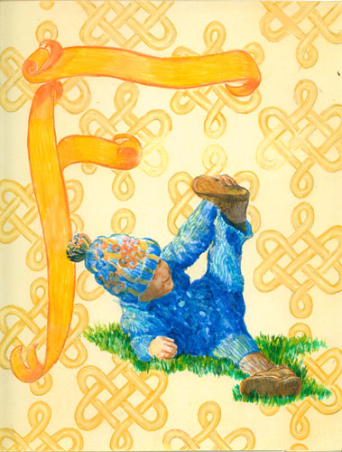
This illustration is a sample of my current illustration style.
My initial problem was to get nice smooth graduations in a monochromatic background for a page in an alphabet book. I'd come up with the concept to paint designs as a kind of "wallpaper" background with the main image, text and large alphabet letter going on top.I wasn't using any computer graphics for this particular book, I don't use an airbrush, and I was working in acrylics....not known for their ease of getting a smooth graduation in colours.I had been studying the work of a 20th century illustrator Maxfield Parrish, and found that he tackled the problem of smooth backgrounds with glazes "pounced" with a large soft brush. Since he worked in oils (i.e. a time before acrylics), he used linseed oil as his glaze medium, and layers took foreeeeever to dry. I am lucky to be living with acrylics, so I could update the technique for my illustrations. I also didn't like the look of pounced glazes....still too many marks in the paint surface
I hit upon the idea of using sponge brushes after looking at a home dec magazine, and reading about faux finishes. AHA! here was the way to get my smooth colour graduations without any visible brush marks. I bought a collection of different sponges....all the way from sea sponges (which have beautiful textures, when that's what you want) to roller sponges from the paint store to makeup facial sponges sold to apply makeup.

I went thru my paints and found a sample of Golden (brand name) Glazing liquid and I had numerous bottles of Golden fluid acrylics. Fluid acrylics have the same pigment load as regular paints, but are cut with more clear acrylic so they are the consistency of cream as opposed to regular paints which are more like toothpaste. I found that if I puddled a bit of the glazing liquid on my palette then dropped in a drop of fluid acrylics and mixed with a knife.....I got a lovely looking glaze, that would be accepted readily by the sponge.

I was working on 3 ply bristol board at the time. I ran the sponge brush over the entire board and let it dry. It bent a bit at first, but with some adjustment to the liquid load....the board dried nice and flat. I could then apply another coat if I wanted to modify the colour in some way without any lifting that occurs in watercolours. As an extra added benefit, I found that the "tooth" was just perfect for coloured pencils, without the plastic effect that acrylics normally have.

I ended up with the best of all worlds. I could get my graduations without computer or an airbrush. I could also add texture just by changing the sponge brush I use. And any additional artwork I wanted to put on top would be accepted without any problems.